Typography
Type System
System Overview
Typographic systems create a built-in system of clear hierarchies that organize information and guide users through a product or experience. This system is divided into 6 main groups: Display, Headings, Subheadings, Body copy, UI labels, and Other.
Roles
Display
Display text styles are a variation of the heading element and are the largest type styles used inside of the system. They are reserved for large titles and headings at the top of the page or inside prominent sections like CTA banners or other promotional sections.
Display styles come in 3 sizes: Large, Medium, and Small.
Since these are mainly used as the main title of the page, you will more than likely be using the <h1> heading element to designate to search engines that the display style used is the main title of the page.
For display type, if working with more than one typeface, consider using a more expressive or decorative typeface that is better suited for large-scale usage.
Headings
Headings are suited for short, high-emphasis text that is secondary to the display titles. They are used more often than display headings, often being used as section headings or within rich text formatting.
Heading styles come in 6 sizes to go coincide with the section headings in HTML (<h1> to <h6>)
The type of content or design you are working with will determine whether it is best to use a display style versus a heading style.
If working with more than one typeface, headings can also make use of expressive typefaces, provided that appropriate line height and letter spacing is also integrated in maintain readability.
Subheadings
Subheadings, or subheads, are medium-emphasis text elements that are smaller than both the display and heading styles. They are used for text that remains relatively short but is lower in priority compared to a high-emphasis heading.
They are often set in the same typeface as body copy to differentiate between differently levels of emphasis. Use caution when using expressive typefaces for subheadings to avoid issues related to readability.
Subheads come in 6 sizes from XL to XS. Sizes correlate to body copy.
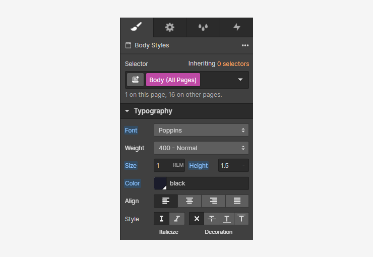
Body Copy
Body styles are used for longer passages of text. They are the default text style in the system and are often used in long-form and short-form contexts.
Use typefaces that are intended for body styles. Typefaces that are readable at smaller sizes can be displayed properly in longer passages and contexts.
Avoid using expressive or decorative fonts for body copy due to legibility concerns.
Body styles come in 6 sizes from XL to XS.
UI Labels
UI styles are utility type styles that are used inside of components such as buttons and dropdown menus.
Labels come in 3 sizes: Large, Medium, and Small. Buttons have their own type style that is unique to them and correlate to the 3 different sizes of buttons.
Other or Miscellaneous styles
Other styles are styles that don't fit into the other 5 categories. This includes unique type styles like blockquotes, overlines, captions, and form helper text.
Responsive Typography
Root Font Scaling
We use rem units for all sizes — not just typography. The rem unit is based off of the root font size.
Everything within this system is designed relative to the HTML font size. This gives us globally-managed control over all sizes in our project.
When the root font size is modified, everything that is tied to the root font size will grow or shrink relative to the root. We can modify the root font size relative to the width of the current breakpoint to make all sizes without our project respond to the size of the viewport.
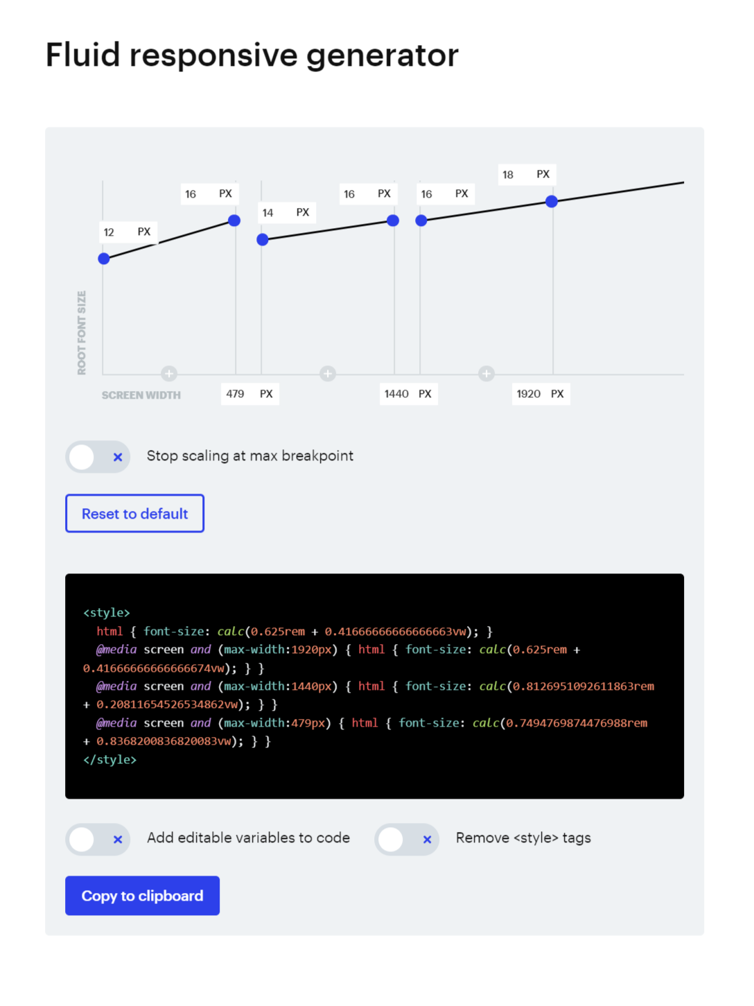
We use custom CSS generated by the Client-first 2.0 fluid responsive generator. The code is inserted into the Responsive Typography embed that is inside of the Styles / Global component. This CSS code modifies the HTML font-size, uses @media queries tied to major breakpoints and uses the calc function to calculate the desired root font size (in rems) plus the breakpoint (in viewport widths (vw)) to generate a unique root font size that scales with the breakpoint. This allows us full responsive control over sizes from the largest of large screens to the smallest of mobile devices.
Type Sizes
font-size: 0.675rem; /* 10px - Mobile */
font-size: 0.75rem; /* 12px - Mobile */
font-size: 0.875rem; /* 14px - Mobile*/
font-size: 1rem; /* 16px - Mobile */
font-size: 1.125rem; /* 18px - Mobile */
font-size: 1.25rem; /* 20px - Mobile */
font-size: 1.375rem; /* 22px - Mobile */
font-size: 1.5rem; /* 24px - Mobile */
font-size: 1.75rem; /* 28px - Mobile */
font-size: 2rem; /* 32px - Mobile */
font-size: 2.25rem; /* 36px - Mobile */
font-size: 2.75rem; /* 44px - Mobile */
font-size: 3rem; /* 48px - Mobile */
font-size: 3.5rem; /* 56px - Mobile */
font-size: 4rem; /* 64px - Mobile */
Type Styles
font-size: 5.25rem; /* 84px - Desktop */
font-size: 4rem; /* 64px - Mobile */
font-weight: 600; /* Semibold */
line-height: 1.25
letter-spacing: -0.025rem; /* -2.5%*/
font-size: 4.5rem; /* 72px - Desktop */
font-size: 3.5rem; /* 56px - Mobile */
font-weight: 600; /* Semibold */
line-height: 1.25
letter-spacing: -0.025rem; /* -2.5%*/
font-size: 4rem; /* 64px - Desktop */
font-size: 3rem /* 48px - Mobile */
font-weight: 600; /* Semibold */
line-height: 1.25
letter-spacing: -0.025rem; /* -2.5%*/
font-size: 3.5rem; /* 56px - Desktop */
font-size: 2.75rem /* 44px - Mobile */
font-weight: 600; /* Semibold */
line-height: 1.25
letter-spacing: -0.025rem; /* -2.5%*/
font-size: 2.75rem; /* 44px - Desktop */
font-size: 2.25rem /* 36px - Mobile */
font-weight: 700; /* Bold */
line-height: 1.25
font-size: 2.25rem; /* 36px - Desktop */
font-size: 2rem /* 32px - Mobile */
font-weight: 700; /* Bold */
line-height: 1.25
font-size: 1.75rem; /* 28px */
font-weight: 700; /* Bold */
line-height: 1.25
font-size: 1.5rem; /* 24px */
font-weight: 700; /* Bold */
line-height: 1.25
font-size: 1.125rem; /* 18px */
font-weight: 700; /* Bold */
line-height: 1.5
font-size: 1rem; /* 16px */
font-weight: 700; /* Bold */
line-height: 1.5
font-size: 1.5rem; /* 24px */
font-weight: 600; /* Semibold */
line-height: 1.5
font-size: 1.25rem; /* 20px */
font-weight: 600; /* Semibold */
line-height: 1.5
font-size: 1.125rem; /* 18px */
font-weight: 600; /* Semibold */
line-height: 1.5
font-size: 1rem; /* 16px */
font-weight: 600; /* Semibold */
line-height: 1.5
font-size: 0.875rem; /* 14px */
font-weight: 600; /* Semibold */
line-height: 1.5
font-size: 0.75rem; /* 12px */
font-weight: 600; /* Semibold */
line-height: 1.5-
font-size: 1.5rem; /* 24px */
font-weight: 400; /* Regular */
line-height: 1.5
font-size: 1.25rem; /* 20px */
font-weight: 400; /* Regular */
line-height: 1.5
font-size: 1.125rem; /* 18px */
font-weight: 400; /* Regular */
line-height: 1.5
font-size: 1rem; /* 16px */
font-weight: 400; /* Regular */
line-height: 1.5
font-size: 0.875rem; /* 14px */
font-weight: 400; /* Regular */
line-height: 1.5
font-size: 0.75rem; /* 12px */
font-weight: 400; /* Regular */
line-height: 1.5-
font-size: 1rem; /* 16px */
font-weight: 500; /* Medium */
line-height: 1.25
font-size: 0.875rem; /* 14px */
font-weight: 500; /* Medium */
line-height: 1.25
font-size: 0.75rem; /* 12px */
font-weight: 500; /* Medium */
line-height: 1.25
font-size: 0.875rem; /* 14px */
font-weight: 600; /* Semibold */
line-height: 1.5
font-size: 0.75rem; /* 12px */
font-weight: 400; /* Regular */
line-height: 1.5
color: 'Neutral 80'
font-size: 1.5rem; /* 24px */
font-weight: 400; /* Regular */
line-height: 1.5
font-size: 0.75rem; /* 12px */
font-weight: 400; /* Regular */
line-height: 1.25
color: 'Neutral 80'